Carousel
Get Inspired
Optimize your ad
We do not recommend using standard icons.
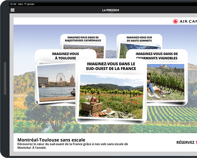
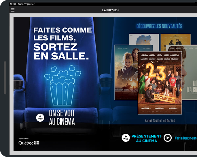
The elements within the carousel are user-friendly and guide the reader effectively, making the interaction easily recognizable and understandable.
You are still allowed to add arrows (in pairs) as visual cues.
Display the elements of your carousel in a way that creates perspective. This makes the interaction easier to understand.
The carousel should contain a minimum of three (3) elements and a maximum of six (6).
IMPORTANT: The quality of image compression affects the total weight of the ad, which impacts the maximum number of images.
Possible directions of interaction: vertical and horizontal
Compatible formats for this interaction
-
Full-screen980 x 670 pixels
Maximum size: 600 ko
Dimensions
Standard: 980 x 670 pixels
Retina: 1960 x 1340 pixels
Learn more → -
Half-screen480 x 670 pixels
Maximum size: 500 ko
Dimensions
Standard: 480 x 670 pixels
Retina: 960 x 1340 pixels
Learn more → -
¼ Horizontal480 x 325 pixels
Maximum size: 300 ko
Dimensions
Standard: 480 x 325 pixels
Retina: 960 x 650 pixels
Learn more →
For improved display quality, we suggest providing your ad images in Retina format, which means at 200% of the final HTML ad format. (The final ad file will retain the standard dimensions with only the image dimensions doubled.)
Example for full screen:
Final HTML file: 980 x 670 px
Assets folder images: 1960 x 1340 px
Pay particular attention to the following points:
Minimum text size in Retina format: 38 pixels
Minimum icon size in Retina format: 80 pixels


